Learning to Draw BGs: Progress Update!
Heeeeeeeeeeeeelllloooooo lovelies! I'm just poppin' in here to do a bit of a document on the process that I'm using to learn how to draw background art for my game, A Future With You! Since it's the half way mark of May's Accountability Jam, I figured now is as good a time as any to drop a little progress update! Since I've had to muddle through quite a bit to find some semblance of a process that works for me and my style, I thought I would share some of the steps I've taken thus far to improve my bg skills. I'm sure it goes without saying that none of this is gospel, the correct way or the only way to do bg art, but here I am saying it anyway! So without further adieu, here are the steps I've been following to make the (to be updated) background art for A Future With You!
Step 1: Function
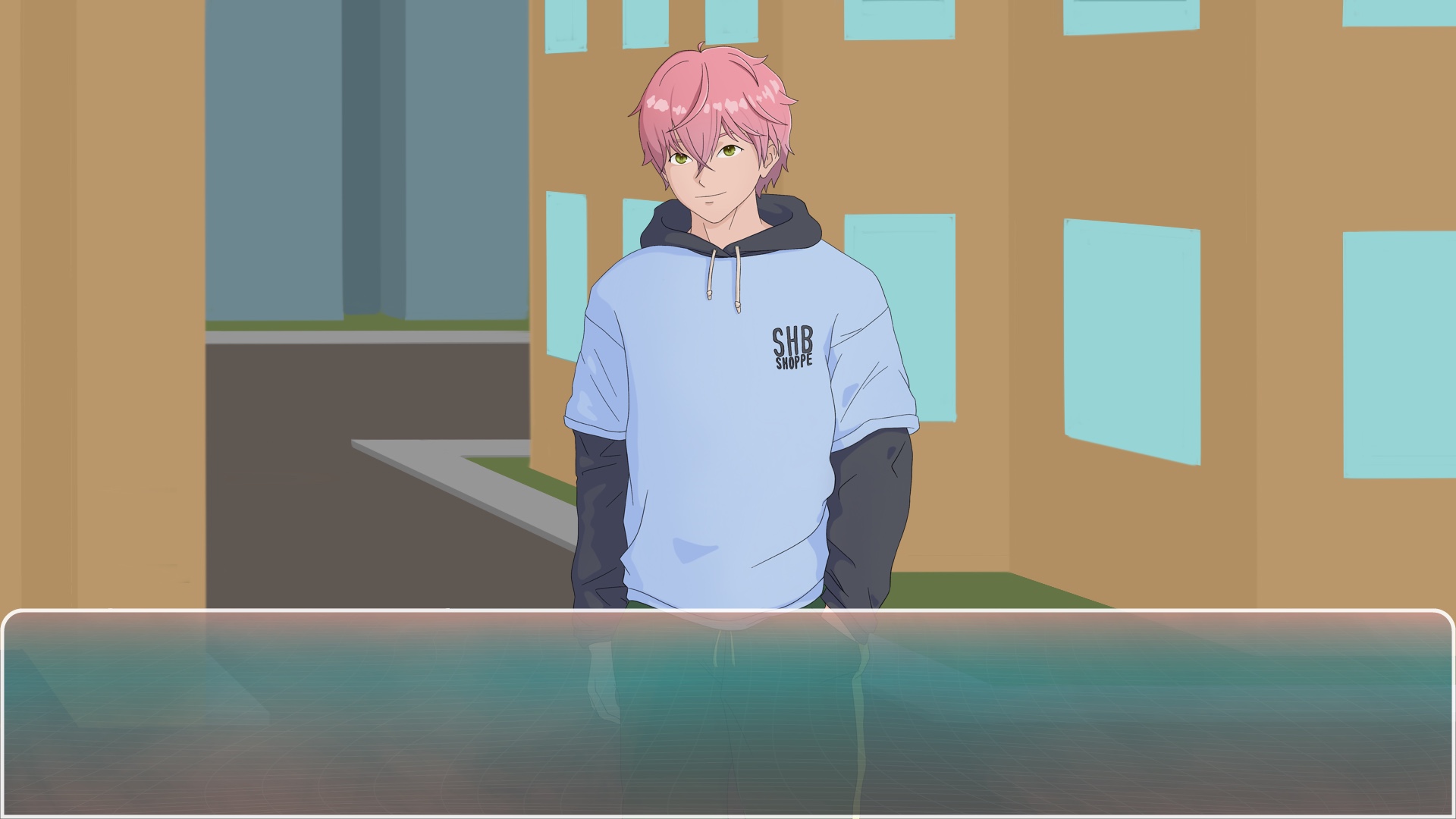
First, I pick the bg that I want to draw and make a few notes about when this background is used, and what function it serves in the story. For this example, I'll use the exterior of my MC's apartment complex.
BTW, here's the original bg art:
This scene is used at multiple points in the storyline, and throughout every route in the game, meaning all of the Love Interests will likely appear in front of it at some point. It serves as a non-intimate home-base for Aria, the MC, to meet with love interests outside her home. Because Aria doesn't remember living there, the complex should hint at the lifestyle she lived pre-amnesia, more so than her current self. And since the game is set in the near future, the building should still seem realistic and relevant using current architecture and cultural customs, but smaller details such as bins, bikes, lighting, etc. can potentially lean futuristic where it makes sense. Should be at least 4 stories, since Aria lives on the 4th floor. Additionally, the scene needs to work for various times of the day, depending on the needs of the story. From this, I can make these notes about the function of this background:
- Should look cohesive with all love interests' character sprites
- Should reflect the city and time that the story takes place; the near future & with influences from Japanese culture, as well as Western & other East Asian counties where it makes sense
- Should reflect Aria's life pre-amnesia, where she was more experienced as a working adult, and more confident about herself, but only in so much that she chose to live in this apartment building rather than, say, a house, a high-rise, the work dorms, etc.
- Should be at least 4 stories tall
- Shouldn't include any personal touches or privacy, as it is outside her home and many others live in the area
- Should be somewhat cozy, rather than expansive and open, so that intimate moments can still occur in the space without it seeming too invasive
- Should work with various colour palettes and lighting schemes; daytime, nighttime, maybe a sunset or sunrise
- Should include multiple light sources that would be shown at night; open windows, lamp posts, exterior building lights, lights from nearby shops, etc.
Step 2. Inspiration & References
Next, it's time to load up whatever website or software you use to gather references. I personally use Pinterest & Google Maps to generate some inspiration and then One Note to organize the images and take notes. But anything will work really.
On Pinterest, I search for photo references using keywords that I pulled from the function list made in the previous step. It may look something like this:
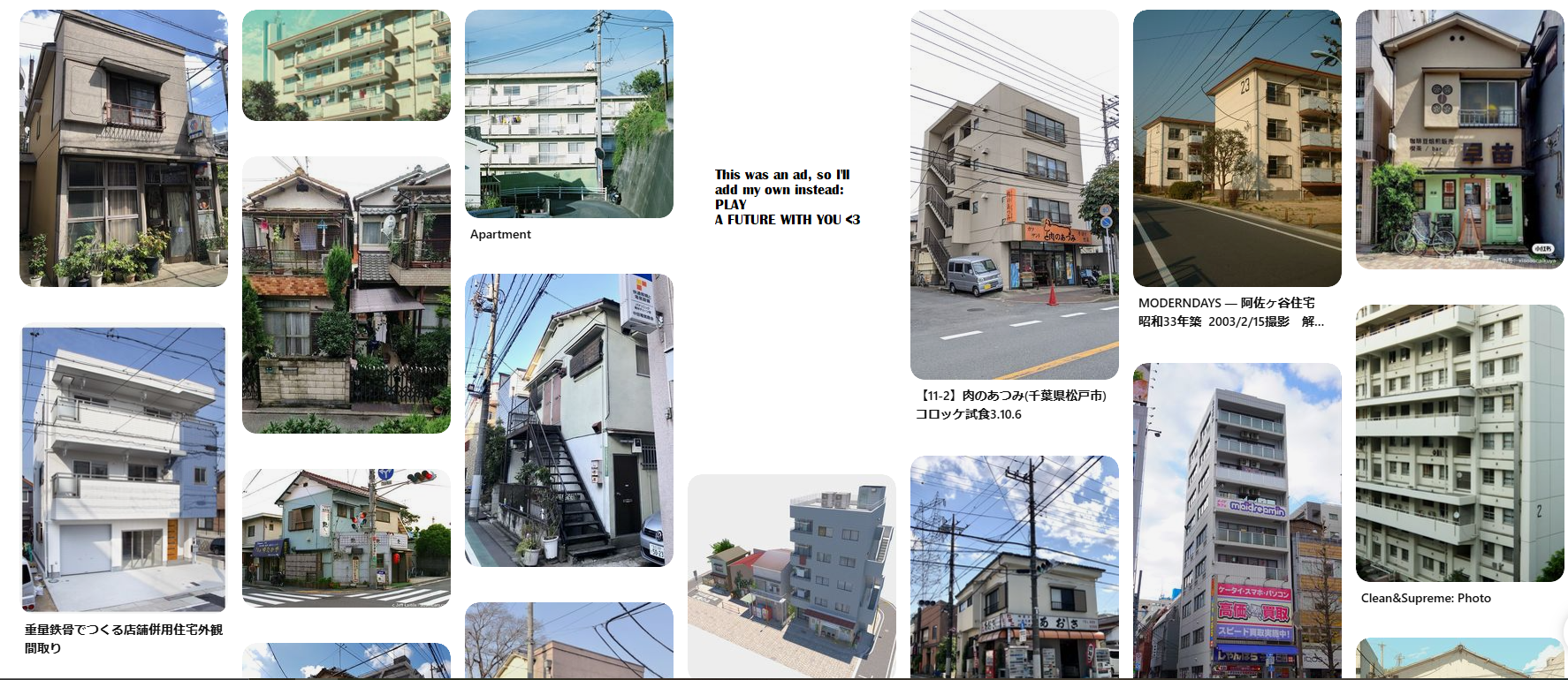
Then, just start finding images you like and clicking through similar images, making sure to save any that are interesting to you and fit with the function list.
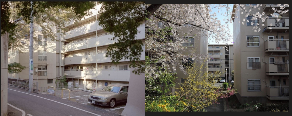
On Google Maps, I use street view to drop the little meeple into various places that I think would suit my needs and click around until I find some references that I like.
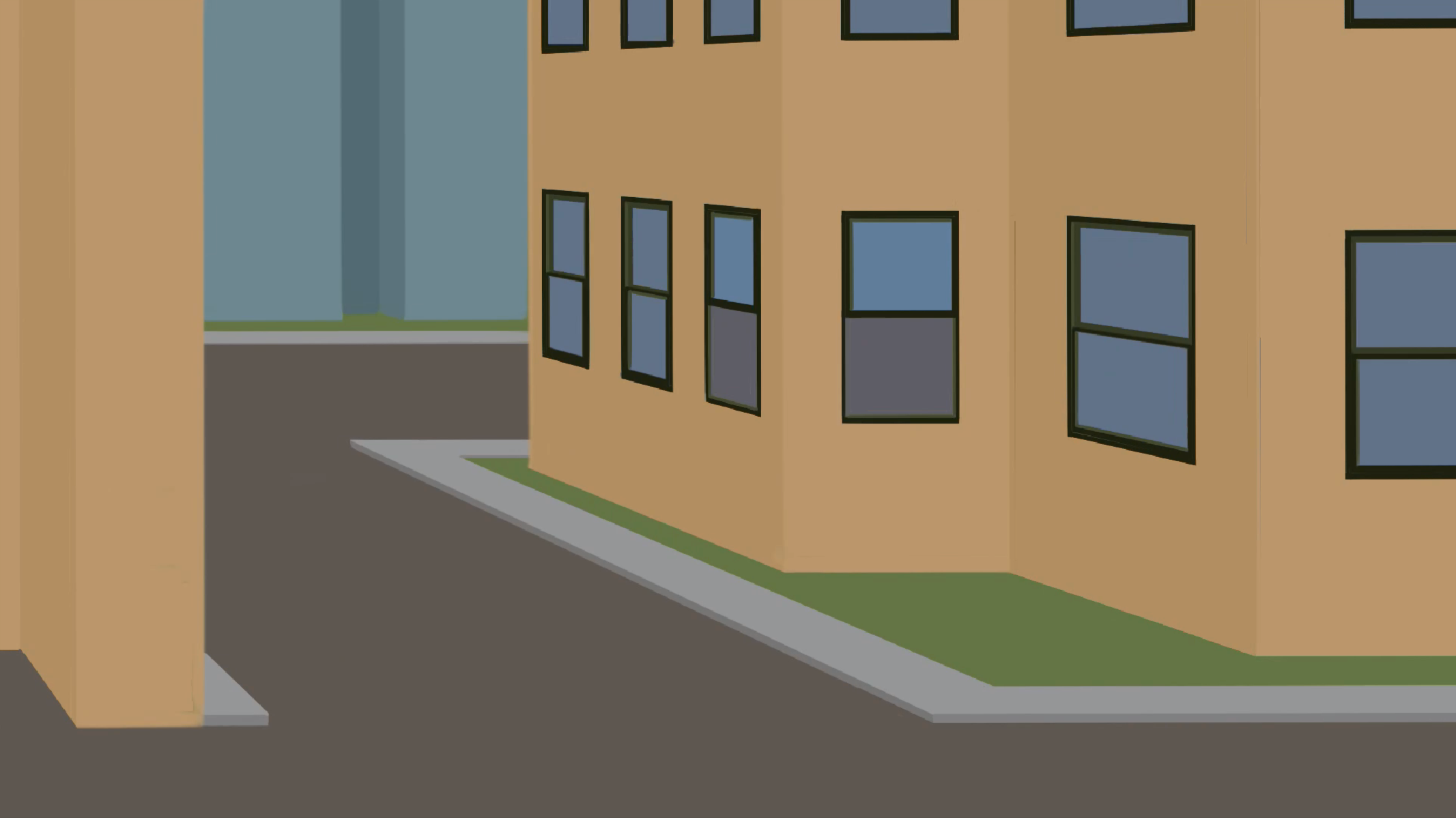
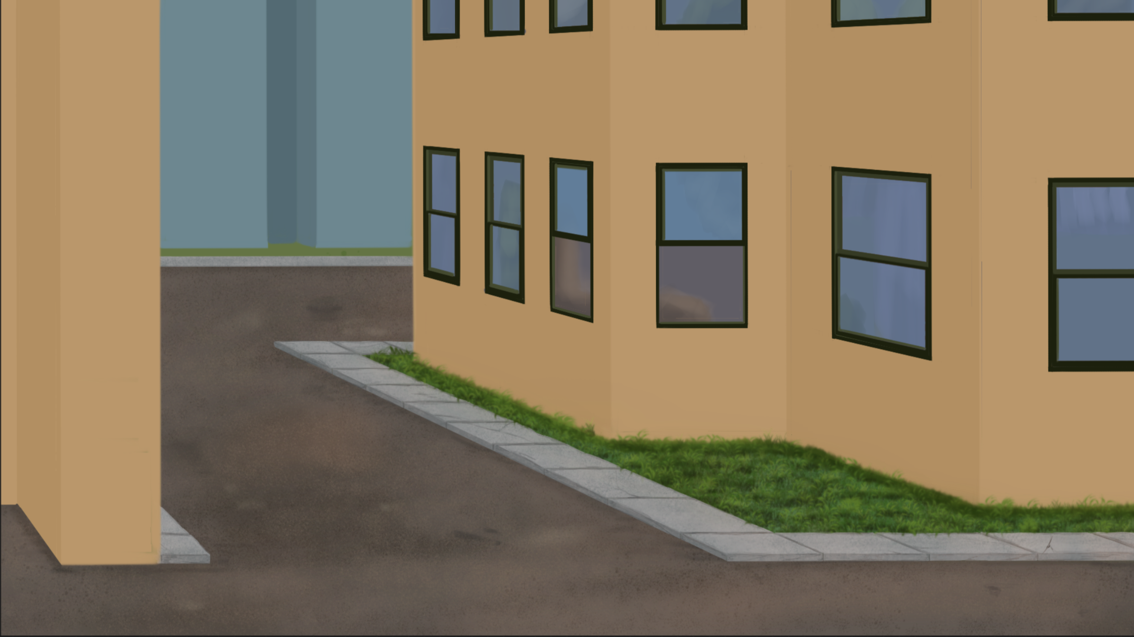
Here's a couple references that I ended up using:
It may also help at this stage to look at other bg's from other games to get a sense of what the illustrated scene might look like. I use Pinterest for this as well as places like DeviantArt, X(Twitter T_T), Instagram, etc. If you can find a few artists that you like the style of that's even better. Personally, I really like to look at Yoshioka Seiko's work for inspiration, some of arsenixc's game art, as well as a few others.
Once I have a basic idea of the background, I move on without getting too much into the details, since there will be another reference pass later on in the process.
Step 3. Planning
Next, it's time to plan the drawing out! Like I mentioned before, I use OneNote to compile all my references and take notes about what I want to use from each one. Basically, the scene will take bits and pieces from all the references, using what I like and works for me, and leaving out what won't look good or just doesn't feel like it fits my desired outcome. At this stage, I decide on the basic details of my scene, such as where the camera will be and where it will be facing, and what will be seen by the camera. For this image, I wanted the camera to be in the parking lot, looking toward the apartment complex. To add to the cozy feeling, I decided to place another apartment building of a similar style behind Aria' building.
One key thing that I always keep in mind during this stage is that the sprites have to seem realistically placed in the scene, which helps determine things like camera height and angle. SKY-Morishita has a great tutorial on this specific thing that's definitely worth a gander before you start getting too far along in your plan. I follow this tutorial roughly to get the scale of my scene correct. One thing that I change slightly is that I lower my eye line/ horizon line, because the camera essentially uses Aria's point of view as the camera, and she is shorter than all the other characters. I also don't match the scale exactly depending on what looks good; I don't feel the need to be so rigid for this purpose, so I don't follow these guidelines exactly, but it's important to keep these points in mind so your scene and sprites are cohesive.
Step 4. Composition
Moving onto composition, it's important to think again about the function of the background. For a visual novel, the focal point is going to be your character sprites, so the background itself should have a fairly balanced composition in my opinion, especially if the background will be getting a lot of use. I only really want the player to focus on the background in specific situations where the scenery is crucial to the storytelling, otherwise, it should be used to inform the story, not to draw attention away. Furthermore, when drawing backgrounds, people tend to think about it in layers; foreground, middle ground, background, but for a visual novel, the foreground is your character sprites, which leaves only the middle ground and background of your scene. Of course, foreground elements can be added where it makes sense, but I find that anything too close to the camera will likely be a distraction or will seem out of place with the scale of the characters, so I try to avoid it.
When all my due diligence is done, it's time to actually grab my tablet and open up my drawing software. Personally, I use Procreate, so that's what I'll be showing here. First, I set my canvas to the dimensions provided by my game engine, Ren'Py, and I also set my app to record a time lapse of the work so that I can always go back and see how I did something.
Next, I do a rough sketch of what I want the scene to look like, not paying too much attention to perspective or scale. Here's a look at my first mock-up:
As you can probably tell, I'm not too precious with it, just sort of scribbling in basic shapes and vibes so that I have something to work off of. Then, I decide on where my horizon line is, as well as my vanishing points. To figure out how to place your perspective point(s), it's best to look at some references and figure out where they place their point(s) to get a sense of how to do it, like how Stephen does it in this video. It also helps to look at some perspective-specific background tutorials. I've watched a few on Youtube that I found very helpful. In particular, I would recommend this video by Art Senpai.
From there I chose my vanishing point and roughly blocked in my buildings using the perspective grid drawing guide. I always keep one of my character sprites handy to ensure the scale looks appropriate. I only add the main planes at this stage.
Step 4: Establishing Forms
Next, I begin adding dimension to the shapes to get a clearer idea of how all the forms work together in the scene. These don't need to be the final colours or even representative of the light or shading of the form, but each item should have a unique hue so that you can easily differentiate them from each other. I also keep the colours flat at this point since I haven't yet determined a light source, and as well, this specific background will have multiple versions, all with different light sources, ie. day, night, sunrise or sunset. For now, I've really only done this step for the windows, which are two paned, where the bottom pane can be lifted to let in some fresh air.
Step 5: Adding Complexity
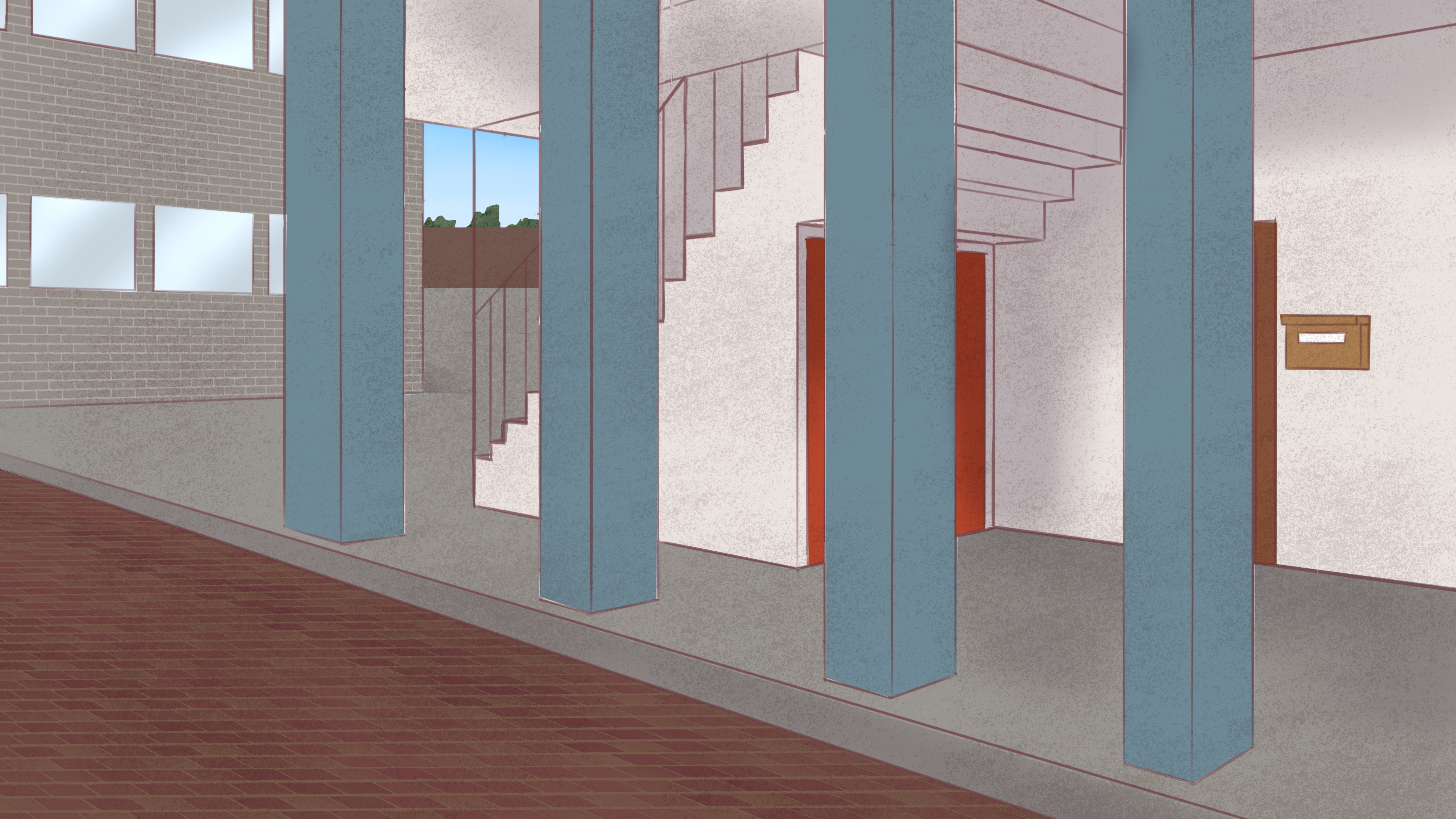
Next, I look at each form in my scene and consider which areas will have more complexity added to them, and may therefore, impact the balance of the composition. For this scene, that means adding some texture to the apartment building, lawn and road, and beginning to populate the windows on the apartment building. This can all remain approximate, but should be fairly representative of what I want for the final scene. Where it makes sense though, I work on the final texture. I tend to do this for any of the areas that don't require a lot of decision making on my part, such as the road and lawn, and then leave the decision making until later, such as with the apartment interior:
Well, that's where I'm at right now, but if you've made it this far, make sure to drop a comment below if you've found this helpful, as well as any tips and tricks artists learning to do game art should know!
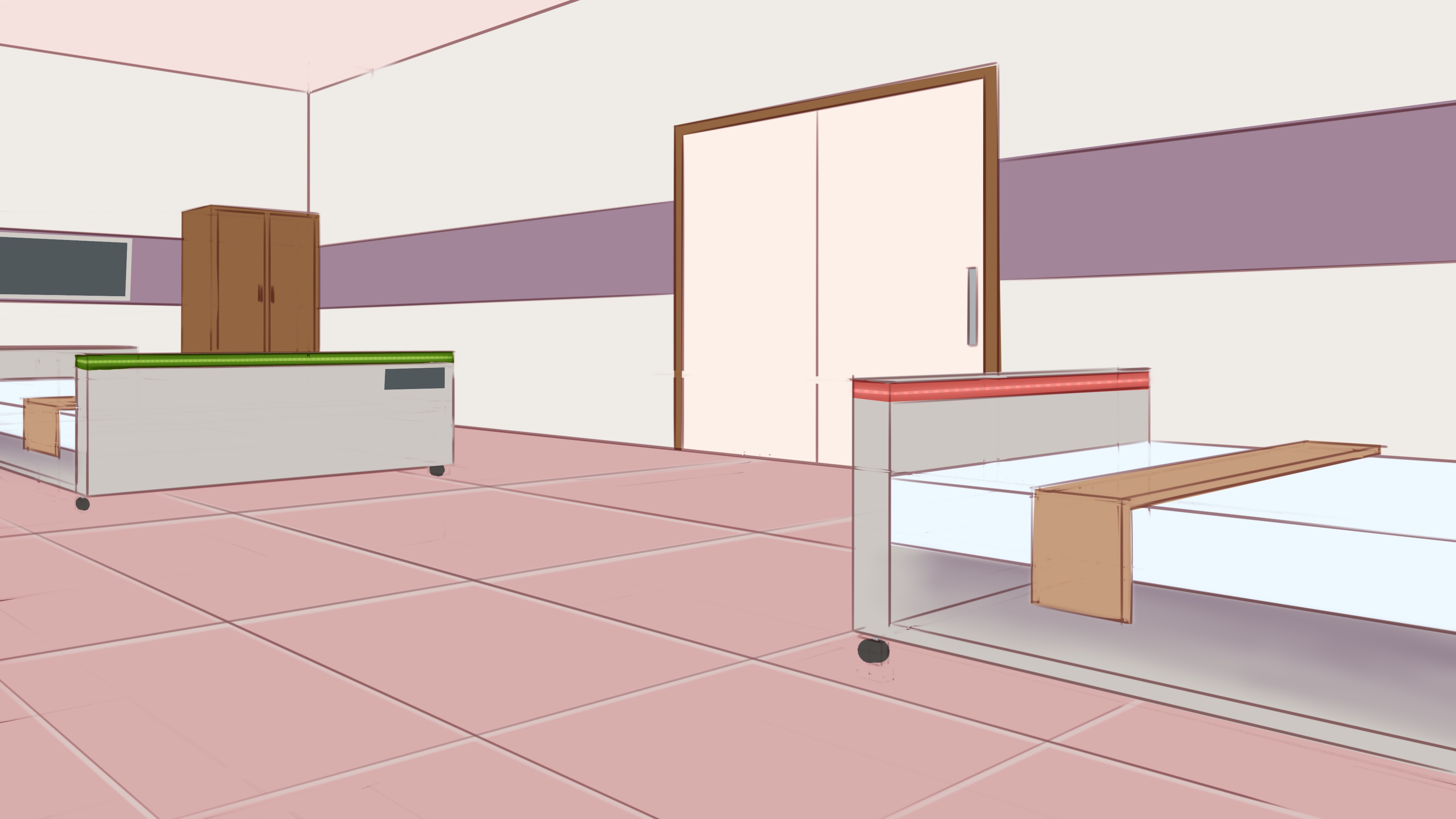
Lastly, here's a comparison for each of the bgs I'm working on , showing first their original version, then their WIP. Don't mind some of the crazy colours, that's all just temporary since there is a lot of different forms being carved out!
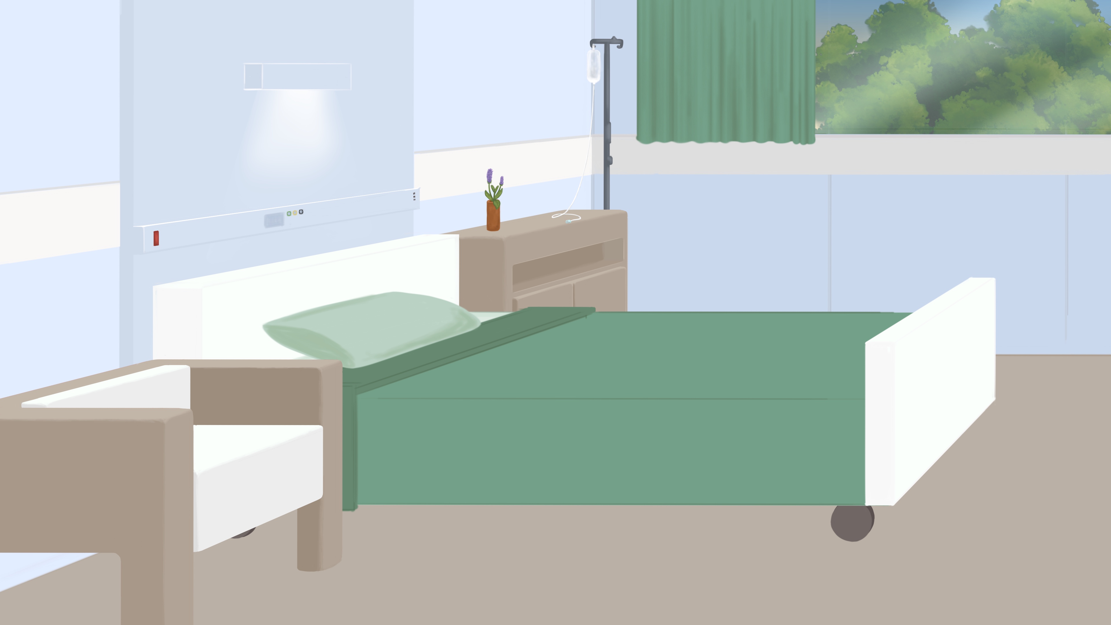
Hospital Ward:
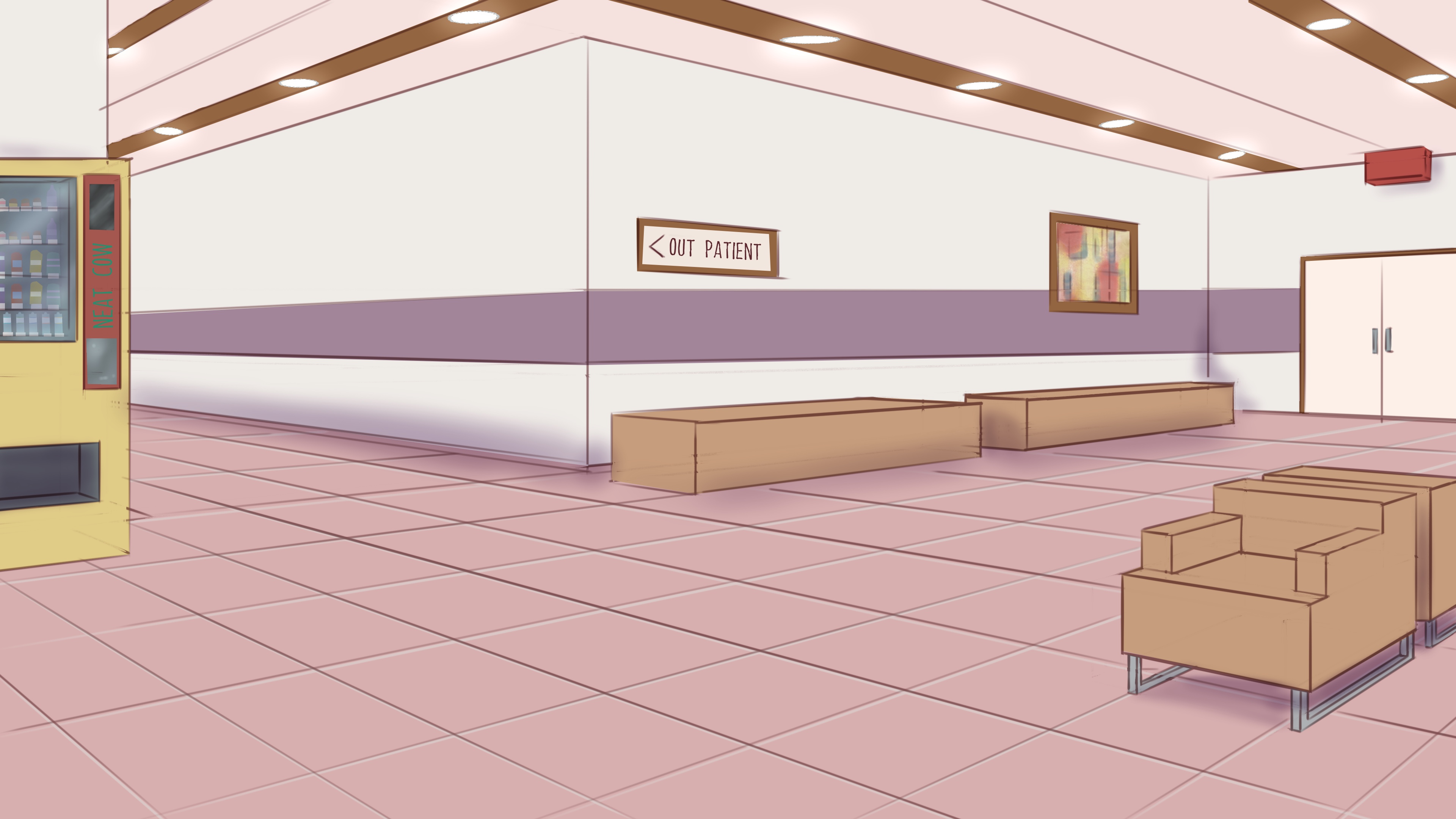
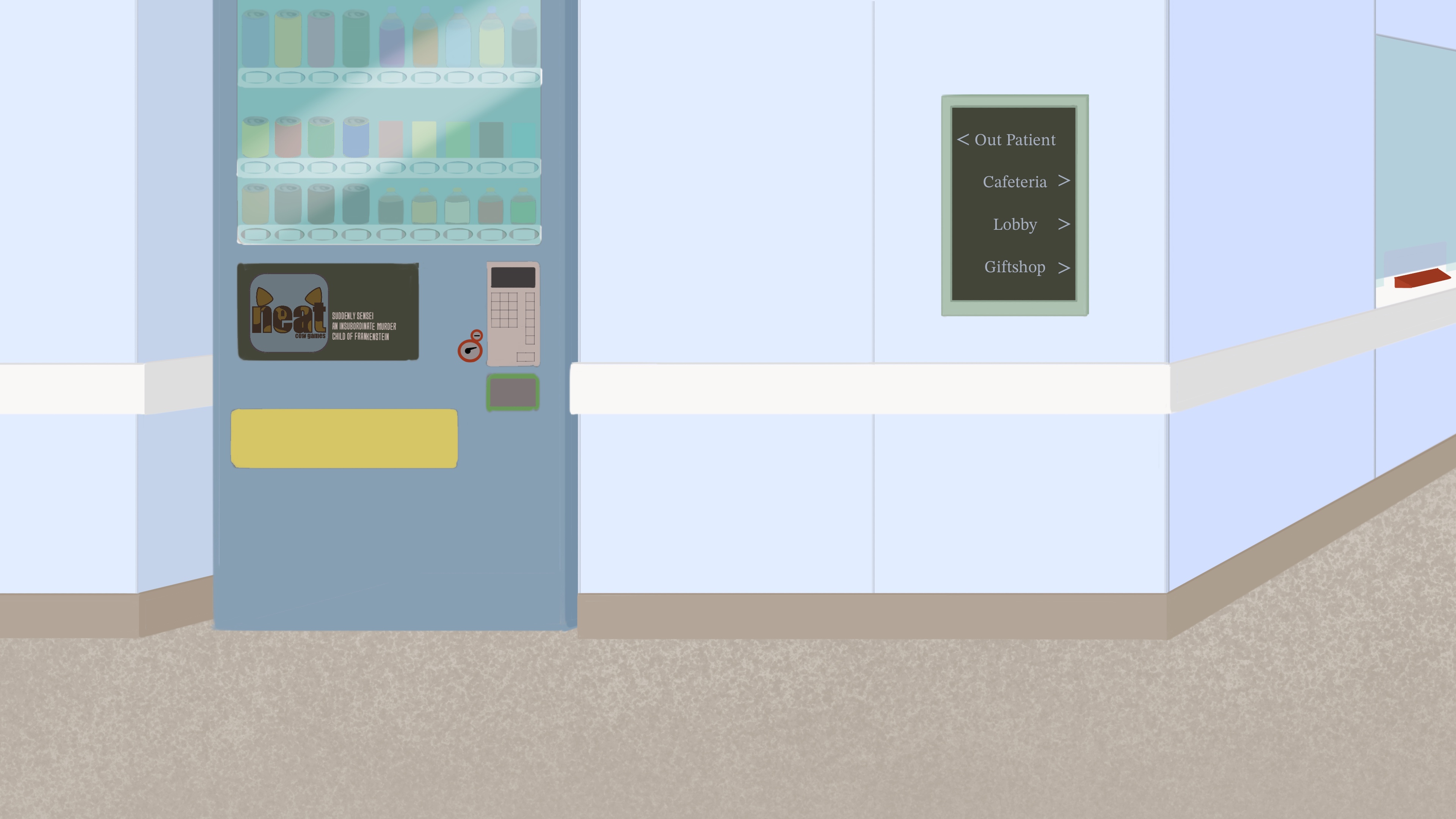
Hospital Hallway:
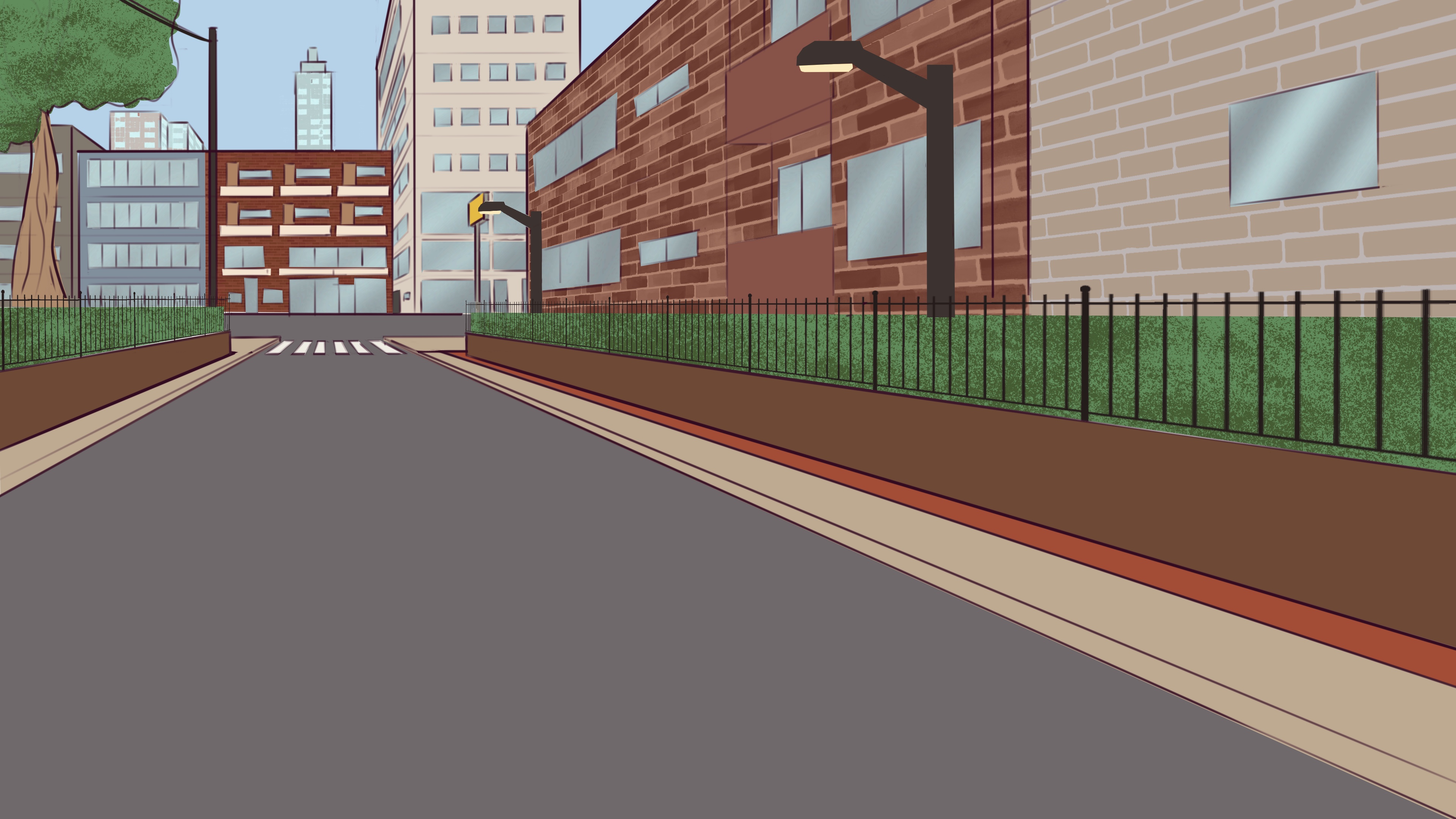
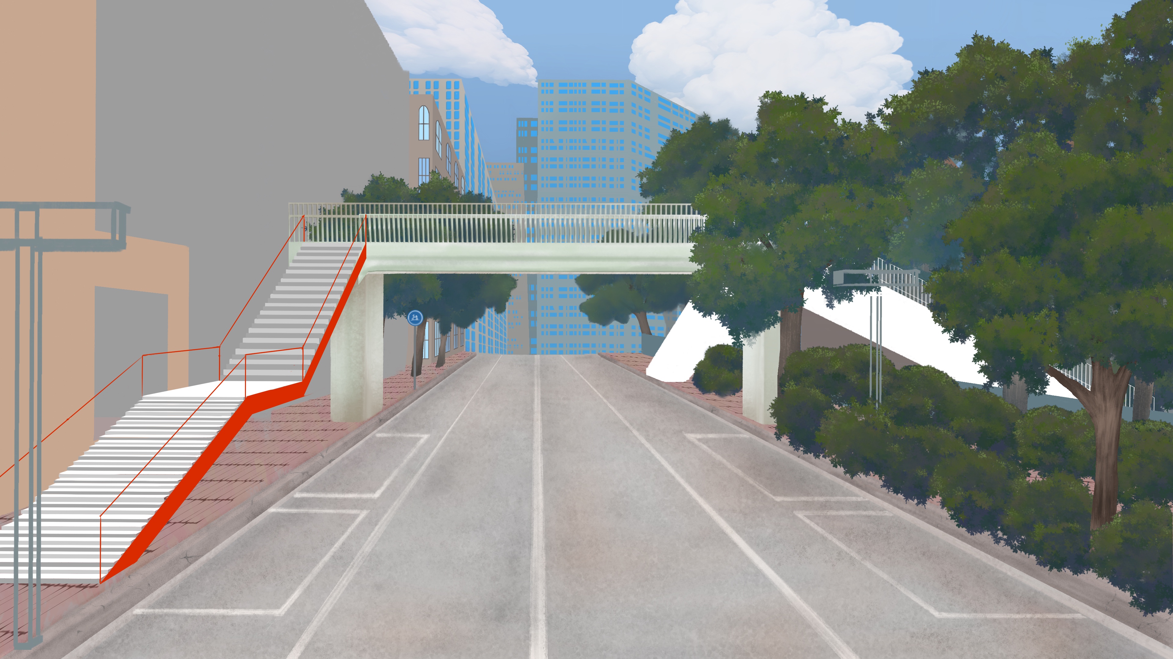
City Street:
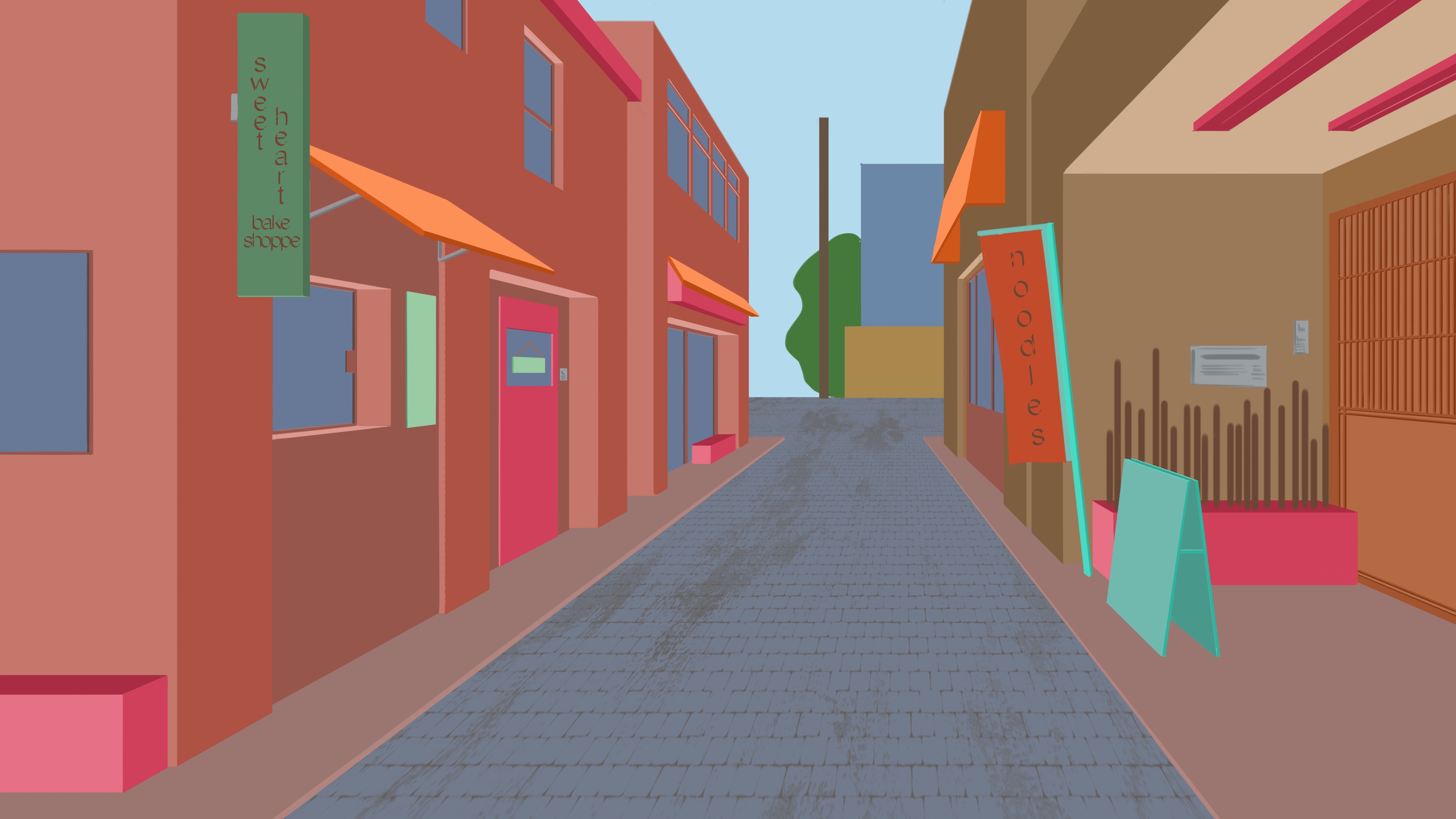
Alleyway:
Thanks for reading and/or playing the demo!
Have a lovely day & remember to be kind!
Moo 🐄
Leave a comment
Log in with itch.io to leave a comment.